
Welcome to our comprehensive guide on best website layout techniques that will skyrocket engagement. As we embark on this journey, we’ll explore how to blend aesthetics, functionality, and user experience into a harmonious digital presence using various types of website layouts.
Whether you’re a seasoned designer or new to the field, this guide is designed to equip you with the skills and knowledge to create websites that not only look great but also provide an exceptional user experience.
Understanding the Basics of Good Website Layout
Defining Website Layout and Its Significance
At its core, a website layout is the arrangement of elements on a web page. It’s how text, images, and interactive components are structured and presented to the user. But it’s more than just aesthetics; a well-designed layout forms the backbone of a website’s user experience.
It dictates the flow of information, guides user interaction, and significantly impacts the overall impression of your site. A coherent and intuitive page layout can distinguish between a user staying engaged or leaving your site.
The Psychology Behind User-Friendly Design
Understanding the psychological impact of your website’s layout is crucial. Humans naturally seek order and clarity, and this principle applies profoundly to web design. Users typically scan a webpage in a predictable pattern, often in an ‘F’ or ‘Z’ shape, looking for points of interest or relevant information. By aligning your layout with these natural scanning patterns, you can enhance user engagement and ensure your key messages get noticed.
User-Centric Design: A Priority
A user-centric approach concentrates on crafting an experience that is specifically tailored to the needs, preferences, and behaviours of your target audience. This method requires a deep understanding of who your users are, what they are seeking, and how they interact with your site, making the user’s focal point central to the design process.
By emphasizing the user’s experience and their focal points, you not only enhance the usability of your site but also boost its effectiveness in achieving your business objectives.
The Role of Responsive Design
With the proliferation of devices of varying screen sizes, responsive design has become a non-negotiable aspect of website layout. A responsive website automatically adjusts its layout to fit the screen it’s being viewed on, whether it’s a desktop, tablet, or smartphone. This adaptability is essential for providing a consistent user experience across all devices and is also a key factor in search engine rankings.
The Golden Rules of Effective Website Layout Design

Rule 1: Consistency is Key
Consistency in website design cannot be overstated. It’s about ensuring that every element of your site conforms to a unified theme, including colours, typography, button styles, and even the tone of your content. Consistency reduces confusion, aids in brand recognition, and provides a more navigable and predictable user experience. Think of your website as a narrative, where each page contributes to a cohesive story.
Rule 2: Clarity Above All
Your website’s layout should communicate your message and make it easy for users to find what they are looking for. Avoid overwhelming users with too much information at once. Use clear headings, bullet points, and spacing to break up text. Effective use of visual hierarchy, where the most important elements are made prominent, guides the user’s attention to key information and actions.
Rule 3: Mobile-First Approach
With the increasing prevalence of smartphones, designing with a mobile-first approach has become imperative. This means starting the design process with the mobile experience in mind and then scaling up to larger screens. A mobile-first approach ensures that your website is accessible and user-friendly across all devices, which is not only beneficial for users but also favourable for search engine optimization (SEO).
Rule 4: Easy Navigation
Effective navigation is fundamental to website usability, serving as a roadmap that directs users to their desired information. To enhance this, ensure your website’s navigation is straightforward, and intuitive, and maintains uniformity across all pages. Employ clear, descriptive labels for your links, and arrange them in a logical order. The objective is to streamline the user’s experience, enabling them to locate what they’re looking for efficiently, with minimal effort
Rule 5: Visual Balance and Alignment
A balanced and well-aligned layout is pleasing to the eye and makes for a more professional-looking website. This involves arranging elements in a way that evenly distributes visual weight across the page. Use grids to help you align elements and maintain proportion and balance. A grid system not only helps in organizing content but also in creating responsive designs.
Layouts That Convert – Best Website Layout Ideas
F-Pattern and Z-Pattern Layouts
Understanding how users scan web pages helps in creating effective layouts. The F-pattern is common for text-heavy pages like blogs or news websites. Users’ eyes move in an ‘F’ shape, scanning the top, then down the left side, and across again. Design your key information (like headlines, CTA buttons, or search bars) along these lines for maximum visibility.
The Z-pattern is ideal for simpler, design-focused pages. The eye tracks from top left to right (like reading a title), diagonally down to the opposite corner (spotting a striking image or info), and then back across to the right (where a CTA or crucial link can be placed). This pattern is excellent for landing pages or minimalist websites.
Grid Systems: Simplicity and Balance
Grids are the skeletal framework of web design. They bring order and consistency to your layout, making it easier to scale and adapt to different screen sizes. The most common is the 12-column grid, but the choice depends on your content. Grids help in aligning elements symmetrically, creating a balanced look and feel that’s both aesthetically pleasing and easy to navigate.
Use of White Space: Less is More
White space is not wasted space. It’s a powerful design element that gives your content room to breathe. It helps in reducing cognitive load, making information more digestible. Proper use of white space around text and titles increases user attention by up to 20%. It also contributes to a design’s elegance and readability.
Visual Hierarchy: Directing User Focus
The arrangement of elements according to their importance defines visual hierarchy. It’s about using size, colour, contrast, and placement to direct the viewer’s attention to the most important parts of your page. Larger, bolder elements will capture attention first. Use this principle to guide users through your content in a way that aligns with your objectives.
Call to Action (CTA): Make It Stand Out
Your CTA buttons are your conversion drivers. Make them prominent in your layout. Use contrasting colours, persuasive copy, and strategic placement (like the end of a content section or the centre of a Z-pattern) to make them stand out. A/B test different CTAs to see what resonates best with your audience.
Conversational Design Elements

Importance of Conversational Interfaces
In an era where digital interaction is paramount, conversational design plays a pivotal role in enhancing user experience. It’s about creating a natural, engaging dialogue between your website and its users. Whether it’s through chatbots, voice assistants, or interactive forms, conversational interfaces can make navigating your website more intuitive and personal.
Integrating Chatbots and Interactive Elements
Chatbots have revolutionized customer service and engagement online. Integrating a well-designed chatbot into your website can provide instant support to users, guiding them through your site, answering queries, or even helping with transactions. Ensure your chatbot is programmed to reflect your brand’s tone and is capable of handling a range of inquiries effectively.
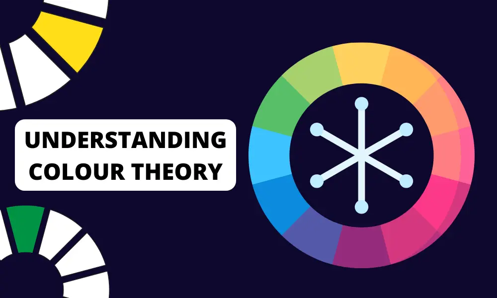
Color Theory and Typography
How Color Affects User Interaction
Colour in web design is a powerful tool, capable of evoking emotions and shaping user perceptions. Understanding colour theory is crucial in choosing a palette that aligns with your brand and appeals to your audience. For instance, blue often conveys trust and stability, making it a favourite for banking websites, while green, associated with nature and tranquillity, is commonly used in wellness and sustainability-focused sites. To delve deeper into selecting the perfect colour scheme for your website, check out our comprehensive Guide to Choosing Website Color Schemes.
Choosing the Right Font: Readability vs. Style
Typography is not just about choosing attractive fonts; it’s about readability and accessibility. The right font can significantly enhance user experience and readability. Sans-serif fonts like Arial or Helvetica are often favoured for their clarity, especially for body text. For headings or accents, more stylized fonts can be used to add character. Remember to maintain a good contrast between text and background to ensure legibility.
Combining Colors and Fonts for Maximum Impact
The interplay of colour and typography can define your website’s personality. Use colour to draw attention to important typography elements like headings or CTAs. However, avoid overwhelming combinations that can detract from the user experience. Tools like colour contrast checkers can ensure that your choices are accessible to all users, including those with visual impairments.
Responsive Typography
Just like your layout, your typography needs to be responsive. Ensure that your font sizes, line spacing, and text alignments adapt well to different screen sizes. Large blocks of text should be avoided on smaller screens, where reading can become cumbersome.
Optimize your website for Speed and SEO
Technical Aspects: Fast Loading Times
In the digital age, speed is everything. Users expect websites to load quickly, and search engines like Google prioritize fast-loading sites in their rankings. To optimize your website’s speed, start by compressing images and using appropriate file formats. Utilize tools like Google’s PageSpeed Insights to identify areas for improvement. Minifying CSS, JavaScript, and HTML can also significantly reduce load times. Additionally, consider using a content delivery network (CDN) to distribute your content more efficiently.
SEO-Friendly Layout Practices
A well-structured, SEO-friendly grid layout goes a long way in boosting your website’s visibility on search engines. Use semantic HTML5 to structure your content, making it easier for search engines to understand the context and relevance of your pages. Ensure that your headings (H1, H2, H3 tags) are used effectively to structure content and highlight key topics.
Mobile Optimization: A Necessity for SEO
With the increasing prevalence of mobile searches, optimizing your website for mobile devices has become essential. Google’s mobile-first indexing prioritizes the mobile version of your site, making it the primary version for indexing and ranking.
To adapt, your website should be responsive, featuring touch-friendly interfaces and ensuring rapid loading times on mobile devices. Utilize Google’s Mobile-Friendly Test tool to evaluate your site’s performance on mobile platforms and ensure optimal user experience.
Schema Markup: Enhancing Search Engine Understanding
Schema markup is a form of microdata added to your website that helps search engines understand the content of your pages better. This can improve the way your site appears in SERPs (search engine result pages), potentially increasing click-through rates. Implementing schema for things like articles, events, and products can give you an edge in search engine visibility.
Quality Content: The Heart of SEO
While technical aspects are essential, the quality of your website content remains a critical factor in SEO. Ensure your content is original, valuable, and relevant to your target audience. Regularly update your website with fresh content, and use keywords strategically without overstuffing. Quality content not only improves SEO but also increases user engagement and trust.
Social Sharing Integration
Integrating social sharing buttons on your website can have a positive impact on your SEO efforts. When users share your content on social media, it increases its reach and can drive more traffic to your site. This social signal can indirectly boost your search engine rankings.
Local SEO: Targeting Local Audiences
For businesses serving specific geographic areas, local SEO is crucial. Ensure your website includes location-specific keywords, and take advantage of Google My Business to increase your visibility in local search results. Including a map and contact information on your site can also enhance local SEO.
Accessibility and Inclusivity
Designing for All: ADA Compliance
Accessibility should be a primary consideration in web design. Complying with the Americans with Disabilities Act (ADA) standards means ensuring your website can be navigated and understood by people with a range of disabilities. This includes screen reader compatibility, keyboard navigation, and the use of alt text for images. Making your website accessible is not just a legal requirement but also a moral obligation, and it broadens your audience’s reach.
Inclusive Design: Considering Diverse User Groups
Inclusive design goes beyond technical accessibility; it’s about creating an experience that is meaningful and usable for a diverse range of users, regardless of their background, ability, or situation. This includes considerations for cultural sensitivities, age groups, and different levels of tech-savviness. By embracing inclusivity in your design process, you’re creating a more welcoming and user-friendly website.
Conclusion
In our exploration of creating the perfect website layout, we’ve delved into a variety of layout ideas and strategies, each aimed at enhancing user experience and visual appeal. From grid systems to asymmetrical designs, understanding and applying these concepts is key to crafting a website layout that not only looks good but also functions seamlessly. Remember, a good layout is one that resonates with your audience and aligns with your brand, ensuring a smooth and intuitive user journey throughout your website
Embracing these design principles is essential for any web designer looking to make a mark in the digital world. Whether you’re redesigning an existing site or building a new one from scratch, always aim for a layout that balances aesthetic appeal with practical functionality. By keeping user satisfaction at the forefront, your website layout will not only meet but exceed expectations, ensuring a memorable and engaging experience for every visitor.