Colour is more than just a visual element; it’s a vital communication tool that shapes the user’s perception and experience. The right colour scheme can make a website not only beautiful but also intuitive and effective. It’s a critical factor in setting the tone, conveying a brand’s identity, and even influencing user behaviour. Whether it’s encouraging a visitor to make a purchase, subscribe to a newsletter, or just engage more deeply with your content, the colours you choose play a pivotal role.
At iM Web Designs, we’ve mastered the art of leveraging colour schemes to enhance user experience and brand messaging. Through this guide “How to Choose Website Colour Scheme“, we aim to impart our expertise to you. Whether you’re a budding web designer, a business owner looking to revamp your online presence, or simply a colour enthusiast, this guide is tailored to help you understand and choose colour schemes that will elevate your website to the next level.
Importance of the Right Colour Scheme for a Website
The colour scheme of a website plays a pivotal role in shaping the user experience and influencing how visitors perceive and interact with the content. Designing an effective colour scheme goes beyond mere aesthetics; it involves a strategic understanding of how colours can convey information, evoke emotions, and establish a strong brand identity. In this section, we’ll explore the significance of selecting the right colour scheme in website design and how it can impact various aspects of user engagement.
- Build a Distinctive Brand Identity: Establish a recognizable visual identity by consistently using colours that reflect your brand’s personality and values.
- Enhance User Experience: Guide users effectively through your site by using a well-designed colour scheme that improves readability and highlights essential information.
- Evoke Emotions and Connect: Leverage the power of colours to evoke specific emotions, creating a deeper connection with your audience.
- Differentiate Sections and Functions: Use contrasting colours to distinguish various sections and highlight important interactive elements for a more organized structure.
- Cater to Your Target Audience: Understand your audience’s preferences and cultural backgrounds, tailoring your colour scheme to resonate with and engage your target demographic.
- Prioritize Accessibility and Inclusivity: Ensure your colour scheme is accessible to all users, including those with visual impairments, by maintaining sufficient colour contrast and adopting colourblind-friendly palettes.
- Reflect Industry and Purpose: Align your colour choices with industry expectations and the purpose of your website to convey professionalism and reliability effectively.
Understanding Colour Theory
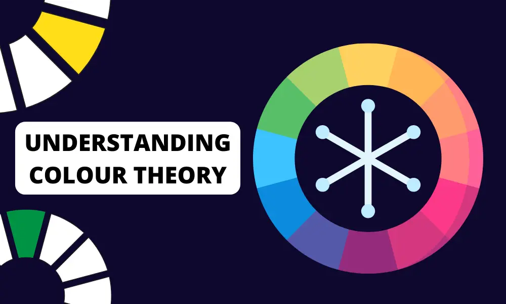
At the core of every visually stunning website is a fundamental understanding of colour theory. As we dive into this topic, it’s important to remember that colour is not just an aesthetic choice, but a tool for communication. Here at iM Web Designs, we’ve harnessed the power of colour theory to craft compelling websites, and we’re excited to share these insights with you.
Basic Concepts of Colour Theory
Colour theory is the science and art of using colour. It explains how humans perceive colour, how colours mix, match, or clash, and the effects they have on a viewer. The three primary colours are red, blue, and yellow – the sources from which all other colours are derived. Secondary colours (green, orange, and purple) are formed by mixing primary colours. Tertiary colours are the result of mixing primary and secondary hues.
Colours Evoke Emotions and Convey Messages
Colours have the power to evoke emotions and convey messages without a single word. For instance, blue often instils a sense of trust and professionalism, making it a popular choice for corporate websites. Red can evoke excitement and urgency, often used in call-to-action buttons or sale announcements. Green, associated with nature, suggests growth and harmony, ideal for eco-friendly brands. Understanding the psychological impact of colours is key to choosing a colour scheme that aligns with your brand’s message and audience’s expectations.
The Colour Wheel and Colour Relationships
The colour wheel is a crucial tool in understanding colour relationships. It’s a visual representation of colours arranged according to their chromatic relationship.
- Complementary colours: These are colours opposite each other on the colour wheel, like blue and orange. They create high contrast and vibrant looks when used together, perfect for highlighting key elements on your website.
- Analogous colours: These colours are next to each other on the colour wheel, such as red, orange, and yellow. They usually match well and create serene and comfortable designs.
- Triadic colours: A triadic colour scheme uses colours that are evenly spaced around the colour wheel. For example, red, yellow, and blue. This scheme offers rich colour diversity while maintaining balance.
- Monochromatic colours: This scheme uses variations in lightness and saturation of a single colour, creating a cohesive and harmonious look. It’s ideal for minimalist and clean designs.
By understanding these relationships, you can create colour schemes that are visually appealing and harmoniously balanced. In the next sections, we’ll explore how to apply these principles to your website’s design to create a truly stunning and effective online presence.
Types of Colour Schemes
In the world of design, the artful combination of colours can significantly impact the visual appeal of a composition. Various colour schemes provide designers with a range of options to create harmonious, balanced, and visually engaging designs. Let’s explore three fundamental types of colour schemes: monochromatic, complementary and analogous, and triadic and split-complementary.
1. Monochromatic Colour Schemes
A monochromatic colour scheme involves using different shades, tones, and tints of a single colour. This creates a visually cohesive and harmonious palette, as all the colours share a common base. Monochromatic schemes are elegant and straightforward, offering a clean and unified look. Designers often use this scheme to achieve a sense of simplicity and sophistication.
Example:
- Deep navy, sky blue, and baby blue in a monochromatic scheme for a serene and calming effect.
2. Complementary and Analogous Colour Schemes
Complementary colour Scheme: This scheme involves using colours that are opposite each other on the colour wheel. The high contrast between these colours creates a vibrant and dynamic look. Designers often use this scheme to make specific elements stand out.
Example:
- Pairing red and green in a complementary scheme for a bold and attention-grabbing design.
Analogous colour Scheme: An analogous colour scheme involves using colours that are adjacent to each other on the colour wheel. This creates a more subtle and unified appearance, making it a popular choice for designs that require a sense of harmony.
Example:
- Combining shades of blue and green in an analogous scheme for a calming and nature-inspired design.
3. Triadic and Split-Complementary Colour Schemes
Triadic colour Scheme: This scheme involves using three colours that are evenly spaced around the colour wheel. Triadic schemes offer a balance between contrast and variety, creating visually interesting and vibrant designs.
Example:
- Using the primary colours—red, blue, and yellow—in a triadic scheme for a lively and dynamic composition.
Split-Complementary colour Scheme: A split-complementary scheme is a variation of the complementary scheme. Instead of using the colour directly opposite, it uses two adjacent colours. This provides a high contrast like the complementary scheme but less tension.
Example:
- Combining red with yellow-green and blue-green in a split-complementary scheme for a balanced yet striking effect.
Understanding these types of colour schemes provides designers with a versatile toolkit for creating visually appealing and impactful designs. Experimenting with these colour schemes opens up endless possibilities for creating stunning and memorable compositions.
Colour Psychology in Web Design

Colour psychology is a fascinating and crucial aspect of web design, as it plays a significant role in influencing user perceptions and behaviours. The colours you choose for your website can evoke specific emotions, convey messages, and significantly impact user experience. Understanding the psychology behind colours can empower you to make informed decisions that enhance the effectiveness of your website design.
How Colour Influences Emotions and Perceptions
Emotional Impact
Colours can evoke a wide range of emotions. Warm colours like reds and yellows often elicit feelings of energy, passion, and warmth, while cool colours like blues and greens convey calmness, trust, and serenity. Understanding the emotional impact of colours allows designers to craft experiences that resonate with users on a deeper level.
- Blue: Often associated with trust, security, and calmness, blue is widely used in business and healthcare websites.
- Red: A colour of energy and urgency, red can increase heart rate and is often used for call-to-action buttons or sale announcements.
- Green: Symbolizing nature, health, and tranquillity, green is a popular choice for environmental and wellness-focused websites.
- Yellow: This colour represents happiness and optimism but can also be overwhelming if overused.
- Orange: A blend of red’s energy and yellow’s happiness, orange is often used to create a sense of enthusiasm and excitement.
- Purple: Traditionally linked with luxury and sophistication, purple can give a website a regal feel.
- Black: Denoting power, elegance, and sophistication, black is often used in luxury product websites.
- White: Representing simplicity and purity, white space in web design can create a sense of clarity and openness.
Perceptual Effects:
Beyond emotions, colours can influence perceptions of size, space, and even temperature. Warm colours tend to advance, making objects appear closer, while cool colours recede, creating a sense of distance. These perceptual effects can be strategically employed to guide user attention and enhance the overall design aesthetic.
Leveraging Colour Psychology in Web Design
Establishing Hierarchy: colour can be used to establish a visual hierarchy on a webpage. By assigning different colours to elements based on their importance, designers can guide users through the content seamlessly. For example, using a bold colour for call-to-action buttons can draw attention to key actions.
Conveying Brand Values: colours can convey specific brand values and characteristics. For instance, a health and wellness brand might opt for calming greens to evoke a sense of nature and well-being. Tech companies often lean towards sleek blues to convey trust and professionalism. Consistent use of colours across branding and web design reinforces these values in the minds of users.
Creating Mood and Atmosphere: The right colour palette can set the mood for a website. Vibrant and contrasting colours might create an energetic and dynamic atmosphere suitable for entertainment or youth-oriented brands. On the other hand, muted and analogous colours could establish a more sophisticated and calming ambience for professional services.
Creating a Connection Between Your Brand and Colour Choices
Brand Recognition: Consistency in colour usage across your brand elements fosters recognition. When users encounter your brand colours consistently on your website, social media, and marketing materials, it strengthens brand recall and builds a lasting impression.
Aligning with Brand Personality: colours can convey specific personality traits. Is your brand adventurous and bold, or is it calm and reliable? Aligning your colour choices with your brand’s personality helps in creating a cohesive and authentic representation that resonates with your target audience.
Cultural Considerations: Understanding the cultural associations of colours is crucial, especially in a globalized online landscape. Certain colours may have different meanings in various cultures, and being mindful of these associations ensures that your colour choices are inclusive and considerate of diverse audiences.
Exciting Color Trends Shaping Modern Web Design
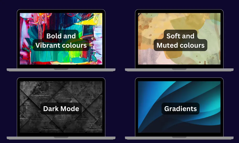
In the dynamic and ever-evolving landscape of web design, keeping up-to-date with colour trends is essential. At iM Web Designs, a leading Leeds-based web design agency, we are dedicated to continuously observing and integrating these emerging trends into our designs. This commitment ensures that our client’s websites are not only fresh and engaging but also at the forefront of digital design innovation. Let’s delve into some of the most popular colour schemes that are shaping the modern web design scene today.
Overview of Popular Colour Schemes
- Bold and Vibrant colours: Moving away from traditional palettes, many contemporary websites are embracing bold and vibrant colours. Bright blues, vivid oranges, and electric yellows are being used to grab attention and make a statement.
- Soft and Muted colours: On the opposite end of the spectrum, soft and muted colours are gaining popularity for their calming and minimalist aesthetic. Pastel tones, light greys, and gentle blues create a serene user experience.
- Dark Mode: Dark mode offers a modern, sleek look while being easy on the eyes. It typically involves dark backgrounds with contrasting light text. This trend is not only stylish but also beneficial for OLED and AMOLED screens, saving battery life and reducing eye strain.
- Gradients: Gradients have made a strong comeback, often featuring bold colours blended smoothly to add depth and texture. They are used in backgrounds, buttons, and graphics to add a dynamic, modern feel.
Creating a Colour Palette that Captivates
Developing a cohesive website colour palette is a crucial step in designing a visually appealing website. At iM Web Designs, we follow a systematic approach to create colour palettes that not only look great but also align seamlessly with our clients’ branding and website goals. Here’s a step-by-step guide along with some tips to help you balance colours effectively.
Step-by-Step Guide to Creating a Cohesive Colour Palette
- Start with Your Brand Colours: If your brand already has established colours, these should be your starting point. They are a part of your brand identity and should be prominently featured on your website.
- Choose a Dominant colour: This will be the most visible colour on your website. It should resonate with your brand and be appealing to your target audience. For instance, a dominant colour for a health-related website might be a calming blue or green.
- Add Secondary colours: Select 1-3 secondary colours that complement your dominant colour. These are used less frequently and provide visual interest and contrast. They can be contrasting (complementary colours) or harmonious (analogous colours).
- Select Accent colours: Accents are for highlighting key elements like buttons or links. Choose colours that stand out against your primary and secondary colours, but still align with the overall palette.
- Incorporate Neutral colours: Neutrals (whites, greys, blacks) are essential for background, text, and empty spaces. They help primary and secondary colours to stand out and reduce visual strain.
- Test Your Palette: Before finalizing, test your colour palette in different applications and on various devices to ensure it looks good and remains functional.
Tips on Balancing Colours
- Use the 60-30-10 Rule: A time-tested interior design principle, this rule states that 60% of a room should be a dominant colour, 30% a secondary colour, and 10% an accent colour. Apply this principle to your website for a balanced look.
- Contrast for Readability: Ensure there is enough contrast, especially with text and background colours. High contrast (like black text on a white background) improves readability.
- Limit Your Palette: Too many colours can be overwhelming. Stick to 3-5 colours in your palette to maintain cohesiveness and clarity.
- Use Tools for Help: Leverage digital tools like Adobe Colour or Coolors to create and test your colour palette.
How to Choose the Right Website Colour Scheme?

Selecting the right colour scheme for your website is a critical decision that can significantly impact user perception and engagement. The colours you choose should not only align with your brand’s identity but also resonate with your target audience and the message you wish to convey. Here’s a step-by-step guide to help you navigate the process of choosing the perfect colour palette for your brand.
1. Understand Your Brand’s Personality
Before diving into colours, it’s essential to have a clear understanding of your brand’s personality and values. Ask yourself: What are the key traits of my brand? Is it professional and trustworthy, youthful and energetic, or luxurious and sophisticated? Your brand’s personality will guide the emotional tone of your colour palette, ensuring that it truly represents who you are as a business.
2. Analyze Your Target Audience
Different demographic groups can have varying responses to colours. Consider the age, gender, cultural background, and interests of your target audience. For instance, younger audiences might be drawn to vibrant and bold colours, while a more mature audience might prefer subdued and sophisticated tones. Understanding your audience’s preferences is key to selecting a colour palette that appeals to them.
3. Study colour Psychology
Colours have the power to evoke specific emotions and behaviours. For example, red can stimulate excitement and urgency, while blue can instil a sense of calm and trust. Familiarize yourself with the basics of colour psychology to choose colours that align with the emotional response you want to evoke in your audience.
4. Ensure Colour Accessibility for a Diverse Audience
Accessibility should be a key consideration in your colour choice. Ensure that your colour palette is web-accessible, providing sufficient contrast for readability and catering to colour-blind users.
- Contrast and Legibility: Prioritize sufficient contrast between text and background colours. Meeting accessibility standards, such as those outlined by WCAG, ensures content is legible for all users, including those with visual impairments.
- colourblind-Friendly Palettes: Design with colourblind users in mind. Opt for colour palettes that maintain clarity for individuals with colour vision deficiencies, enhancing inclusivity.
- Alternative Cues: Avoid exclusive reliance on colour to convey information. Use additional visual cues like icons, patterns, or text labels to ensure all users can access and understand essential content.
5. Consider Industry Standards
While it’s important to stand out, it’s also crucial to consider the colour norms within your industry. Certain colours are often associated with specific sectors; for example, green is commonly used in health and wellness industries, while black and gold are prevalent in luxury markets. Aligning with industry standards can help in establishing credibility and recognition within your field.
6. Start with a Base Colour
Choose a base colour that best represents your brand. This colour will be the most dominant in your palette and is usually your brand’s primary colour. It should resonate with your brand’s personality and appeal to your target audience.
7. Build Your Palette
Once you have your base colour, build the rest of your palette. You can use the colour wheel to find complementary, analogous, or triadic colours that harmonize with your base colour. Ensure a balanced mix of warm and cool tones and consider adding neutral colours for versatility.
8. Test and Get Feedback
After selecting your palette, test it across various mediums to see how it works in practice. This includes digital platforms, print materials, and even physical spaces if applicable. Gather feedback from stakeholders, potential customers, and design experts to refine your palette.
9. Be Consistent
Once you’ve finalized your colour palette, use it consistently across all your branding materials. Consistency in colour usage strengthens brand recognition and creates a cohesive brand experience across all touchpoints.
Top Tools To Help You Choose the Right Colour Palette
Selecting the right colour palette for your website can be a challenging yet crucial part of the design process. Fortunately, there are several online tools designed to simplify this task. These tools can help you create a colour scheme that aligns with your brand’s identity and enhances the overall user experience of your website. Here are some of the top tools available:
1. Adobe colour
- Features: The Adobe colour wheel is a powerful tool that allows users to create colour schemes based on various colour rules, such as analogous, monochromatic, or triadic.
- Benefits: It integrates seamlessly with other Adobe products and offers the ability to save colour themes to your Adobe account.
- User Experience: With its intuitive interface, Adobe Colour is suitable for both beginners and experienced designers.
2. Canva Colour Palette Generator
- Features: Canva Color Palette Generator generates colour palettes from uploaded images.
- Benefits: This is particularly useful for brands that want to create a colour scheme that complements a key brand image or logo.
- User Experience: Known for its user-friendly design, it’s ideal for those who are not professional designers.
3. Coolors
- Features: Coolors.co is a fast and easy-to-use colour scheme generator. It allows you to generate colour palettes automatically or manually.
- Benefits: The tool offers an option to upload an image and generate a colour scheme based on that image, which is great for drawing inspiration from existing visuals.
- User Experience: Its simple interface makes it accessible for users of all skill levels.
4. Colour Hunt
- Features: Colourhunt.co offers a wide range of hand-picked colour palettes for inspiration.
- Benefits: It’s a free and open platform, constantly updated by a community of designers and artists.
- User Experience: The straightforward layout allows for easy browsing and selection of colour palettes.
5. Paletton
- Features: Paletton.com is designed to help create colour combinations that are visually harmonious.
- Benefits: It includes a live preview feature, allowing you to see how your colour choices will look in a real-world application.
- User Experience: The tool provides more control for users who want to get into the details of colour theory.
Crafting a Symphony of Colours: The Art of Perfecting Your Website’s Palette
In conclusion, every colour has its own personality and impact. Your main colour sets the stage, while additional colours complement and enhance the overall design. A well-chosen background colour can elevate your main colour, making it stand out and speak louder. It’s like orchestrating a symphony where each colour plays its part in harmony.
Remember, there isn’t one colour that fits all. The best colour for your website depends on your brand, your message, and your audience. While some prefer the boldness of uncommon colours, others find beauty in more common colour associations. The magic lies in how these colours are combined and utilized.
The goal is to ensure that the colours on your website do not just exist side by side but interact and form a cohesive unit. A stunning website colour scheme is one where balance, contrast, and harmony come together to create an unforgettable user experience.
As you embark on the journey of selecting colours for your website, keep in mind that every colour has a role. Experiment, test, and don’t be afraid to try something new. Sometimes the most unique and effective colour palettes are born from a willingness to explore uncharted combinations.